Using InDesign, I set my page up like this. The size is A3, with 5mm bleed and the rulers set at equal spacing.


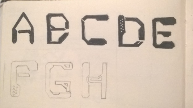
I decided to keep the theme very plain for the zine, I wanted to present the ideas in a factual and almost clinical sort of way to reflect the ideas of precision and emotionlessness associated with machines. I used Futura Bold again for the headings, to keep it inline with the “Man & Machine” title pieces I did, and for the same reasons I used it on those. For the body, I used Courier New for the body text, as that is the font used in many coding programs so it’s instantly recognisable as that. I thought about using something else but the way the content is set out means it visually needed to be in Courier. I increased the tracking and leading no the body text slightly to make it lighter on the eye and I think the fonts work well together because of it. Futura really draws attention and then Courier is nice and easy to read. It has a good science-fiction feel to it. The images are placed centrally with a moderate space in between. The fact they are predominantly black means people will focus on that first, even though they’re always on the right hand page. This means they’ll look at that first, then backtrack to the explaining text on the left side of the spread. Having Machine on the front and Man on the back is something I think I should have done the other way round, after all the phrase goes that way. I like them place dead centre, but at the same time I think I should have experimented more first with other arrangements. Another idea could have been to make the back page black with “Machine” in white, to make it clearer where to start.
For the poster inside, I decided to ask the question I’ve been trying to answer all along, to get people to think and discuss it. I used the generative graphics circles as the background, and gave it a slight gradient to fade it out towards the quote. This works nicely, making the quote stand out more from the background than it did to begin with. I had to credit Asimov of course, and I also included the date the quote came from, to add a bit of a shock factor that people were thinking about this sort of thing back in 1981 – typically we think of robots and AI as modern; the future, but clearly it’s been around for longer than expected, so maybe the answer in a hundred years will be no, robots are not creative. Typesetting the quote, I used Futura again, and set the alignment to justified to make it clear that it’s a quote and to turn it into a block which counter balances the title question at the top, and the name at the bottom.


Overall, I feel this project turned out okay. I definitely think I should have spent more time experimenting with type than working on Processing and generating ideas around my topic. My final piece is nice and clean, which I’m really happy with, but I just have a nagging feeling that I should have included something more, like the idea of the instructions and breaking rules that I thought about in the first two weeks.